
Design
–
May 10, 2023
Unpacking exceptional healthcare logos

In the land grab of digital health that was 2020 to 2021, it feels like brands were hastily created and company names slapped together.
New co = [person’s name, plant, or food] + Health.
Looking through all the landscape graphs…so many logos have boring infinity swoosh symbols or triangular ‘synergistic’ shapes. When you see all of them together, great logos suddenly stand out.
As the first introduction to a company, a logo and wordmark, if designed well, draw a genuine connection to your brand. Because the bar for design is already so low in healthcare, it becomes memorable and inseparable.
This post is a living list of our favorite brands in digital health, life sciences, private practices, and the larger healthcare industry, and how they intentionally align their branding and company values. Let’s dive in.
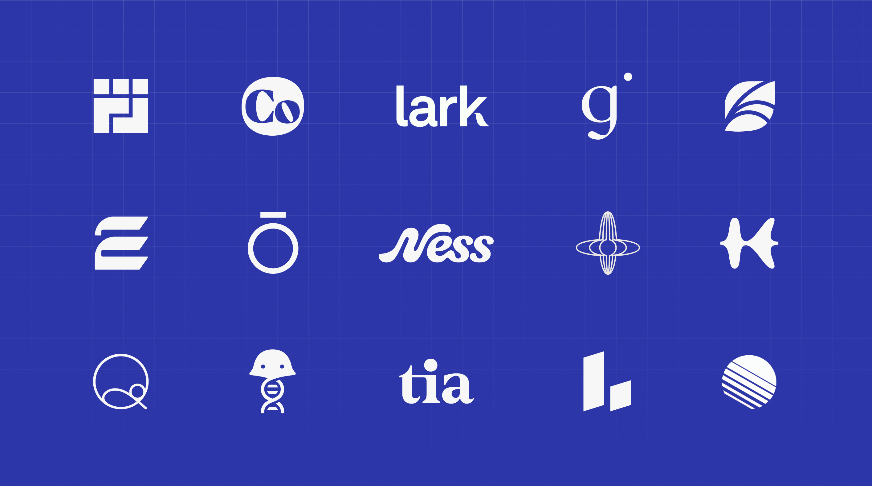
1. Cityblock Health
Cityblock has an unbelievably impressive logo. Maybe even our all-time favorite? With a mission to help those be seen, be heard, and be healthy, Cityblock publicly stands for radically different, member-first healthcare. In their logo, you see a city block, a defiant fist, and a loving family. They communicate multiple company values with one simple design.
2. Galileo
We had to brush up on our history of Copernican Heliocentrism, but there’s a subtle nod to the person who famously said “and yet it moves” about the earth (the o in Galileo's wordmark) and the sun (the yellow asterisk). The o is even slightly tilted inward like the earth on its axis, with this same brand detail translating to the g in their favicon. This masterful logo and company branding amplifies Galileo's mission of bringing care closer to patients, whether at home, in your community, or on your mobile device.
3. EmpiricaLab
EmpiricaLab, a digital library product that empowers healthcare teams to organize and distribute their collective learnings efficiently, ties their bright, bold E logo into a stack of books (growing stack = more team knowledge). Depending how jaded you are as a healthcare professional, you might also see a stack of folders and paperwork in need of digitizing.
4. Fair Square
Speaking of paperwork, seniors are literally mailed government brochures to choose their Medicare insurance. With its logo as a single dog-eared piece of paper, Fair Square indicates it’s the *only* resource seniors need for this complicated decision.
5. Benchling
Though we said too many health tech companies pick animals to represent their brand, Benchling does it tastefully. Neena Parikh has a great post on her Medium account on the history of jellyfish in life sciences, showcasing how their mascot, a jellyfish with DNA tentacles, gives homage to the use of GFP (green fluorescence proteins) in the life sciences industry. Best insider logo. IYKYK!
6. Pelvic Rehabilitation Medicine
To represent the anatomy of the pelvis, Pelvic Rehabilitation Medicine's graphic resembles both a butterfly and a… let’s just say, once you see it, you can’t unsee it. It’s rare that a medical practice invests in a tactful logo with a deeper meaning.
7. WHOOP
By reflecting the data visuals for tracking your HRV, sleep, and other biometrics, WHOOP showcases the quantified self movement directly in their wordmark. And for those familiar with the app design, a circle is displayed throughout the app's interface to measure your performance to each metric (a complete circle = 100%). The same O shape is used in the wordmark to implicitly inspire you to use data to reach your maximum potential.
8. ŌURA
Oura is a rare and excellent case where a logo also resembles the company’s physical product. Oura communicates both the shape of their hardware (the o for the ring) and how it represents the interface (the line above it) into one’s health data.
9. Actual Veggies
With an earthy look, Actual Veggies’ logomark forms both an A and V through a plant and its roots. They nicely separate their two words with a line symbolizing the earth, and pick a dark, almost clay-colored maroon like a beet or sweet potato. We love the thoughtfulness this team took for their branding as well as their products - highly recommend their tasty burgers!
10. Levels
Like Whoop, Levels effectively ties their L logo back to their product (blood glucose and metabolic tracking). Simple logos are often the best, and we think this company has the most distinct and recognizable brand in their industry.
11. Lenox Hill Radiology
If you live in NYC, chances are you’ve been to a Lenox Hill Radiology facility for an X-ray or CT scan. LHR has a blunt, but clever, logo that shows a skeuomorphic X-ray of their acronym.
12. Farewell Fax
Shameless plug here…we built a job board to help our clients and network hire, and I love the work our design team did. Why do we still use fax machines in healthcare?? Does Gen Z even know what they are? When we colonize Mars, will we still be asked to use them there? For fax sake.
13. Tia
Tia's lowercase wordmark humanizes their brand as an approachable and trusted confidante. Together as a community, women are inspired by the characteristic hot pink period to speak up and boldly bring “taboo” women’s health topics to the forefront.
14. Kintsugi
Kintsugi encourages us to see (and hear) mental health differently. The soundwave-shaped K logo astutely conveys what their product does—using voice biomarkers to detect signs of depression and anxiety. To us, Kintsugi has one of the most relaxing logos to observe, like a piece of art in the MoMA.
15. Geode Health
Geode (a rough-looking and often oddly-shaped rock with crystals on the inside) thoughtfully uses a metaphor to express treating mental health. Finding the right therapist can unlock our best selves, and Geode Health’s metaphor remains on point.
16. Spring Health
With a classy and enterprise-friendly brand, Spring Health’s leaf logo emphasizes the act of growth, with veins that allude to the unique stories that unfold throughout each member’s mental health journey. Like the season, Spring evokes hope, newness, and change.
17. Ness
Alluding to the mythical creature, Ness aesthetically combines their font and mascot. Their domain name, Nesswell.com, is also a clever play on wellness. Even their lowercase ‘s’ looks like a smaller mascot.
18. Quilted Health
Their thin, text-stroke “Q” logo represents a thread and the looping of a knot, but also a child resting safely in a quilt. With a mission to provide comprehensive pregnancy care, Quilted Health seamlessly ties their brand and logo together.
19. Two Chairs
With the eloquent Feijoa font and a unique ligature between characters, Two Chairs' brand feels alive, distinct, and characteristically personal, just like the therapy they provide.
20. Othership
Othership's transformative logo communicates the balance necessary in life. Like a spinning top, the horizontal and vertical lines represent their values of creating space to shift emotionally, physically, and mentally. We also see hints of gravitational waves and space-time themes.
21. Forward
Forward's futuristic and subtly F-shaped logomark communicates progress, motion, and improved tech-enabled healthcare delivery. As part of their mission, Forward believes that "healthcare must be rebuilt on hardware and software rails." The two rails in their logo represent the iterative steps they're taking to get us there.
22. Ash Wellness
Another logo that visually communicates its physical product, Ash alludes to a recognized blood diagnostics tool (a lancet) in the shifted A of their logomark.
23. Freshpaint
As a no-code CDP, Freshpaint connects platform analytics into a red/green visualization familiar to data managers, but also like fresh strokes of paint.
24. Cofertility
With the off-center ‘o’, and the two “i’s” at different heights, Cofertility artfully shares how no fertility journey is as expected and their mission to support the many ways families can be created.
25. Lark Health
Like Shakespeare, who uses larks to depict a new dawn in literature, Lark Health thoughtfully incorporates this bird into their wordmark to inspire optimism through their on-demand weight loss coaching.
26. Function Health
Investing early in one's health can have compounding results over time, and Function's logo cleverly shows this gap-closing trajectory. The circle with improving coverage represents their belief that health depends on awareness, and that deepest awareness can be achieved through whole body lab testing.
27. Out-of-Pocket Health
A sketch that da Vinci himself would envy, Out-of-Pocket combines a Caduceus staff with a shrug emoji, where the subject appears apathetically strangled. This accurately conveys the irony of our health system as well as Nikhil's writing style and A+ memes.
28. Prenuvo
Like an MRI machine, Prenuvo's sideways P logo takes a simple, skeuomorphic approach to representing whole body, preventative health screening.
29. Omada Health
A fingerprint, unique to everyone, symbolizes the custom approach Omada takes to delivering personalized, data-driven care programs to help people make lifestyle changes.
30. Hatch
Using the negative space “H” in their logo like a maze, Hatch capably shares their mission of providing better patient navigation. It's a nod to their 'hatchways' (matching algorithm pathways) that help patients gain access to the ideal provider for them based on preferences and availability.
31. Eight Sleep
With digital clouds, spring bed coils, weaving heating and cooling wires, and 8 hours of sleep, Eight Sleep does it all in one iconic logo.
Conclusion
When building a health tech or life sciences company, it’s easy to ignore your branding if you have strong product market fit, quick access to capital, or a technology and distribution moat that makes branding irrelevant. But when you do decide to invest in your brand, AND do so intentionally, you’ll be able to stand out even more in healthcare.
Share:
