Designing a platform and product experience to increase usability and remove barriers to care.
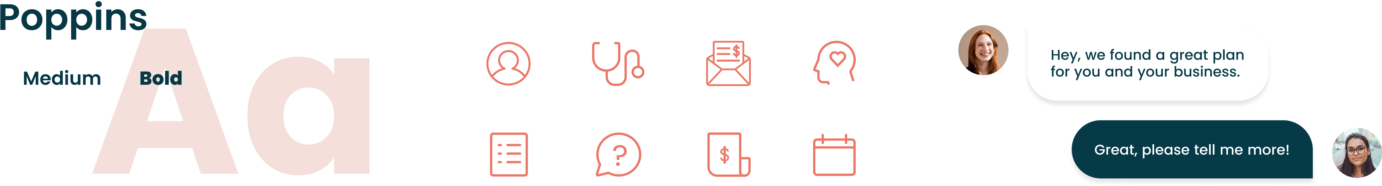
UX & UI Design
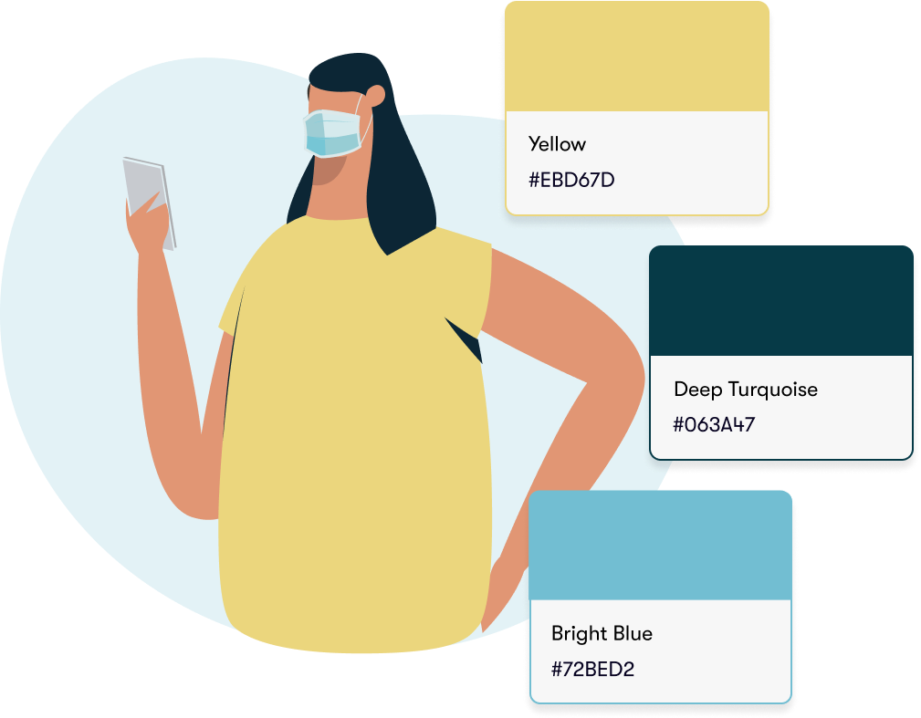
Branding & Website
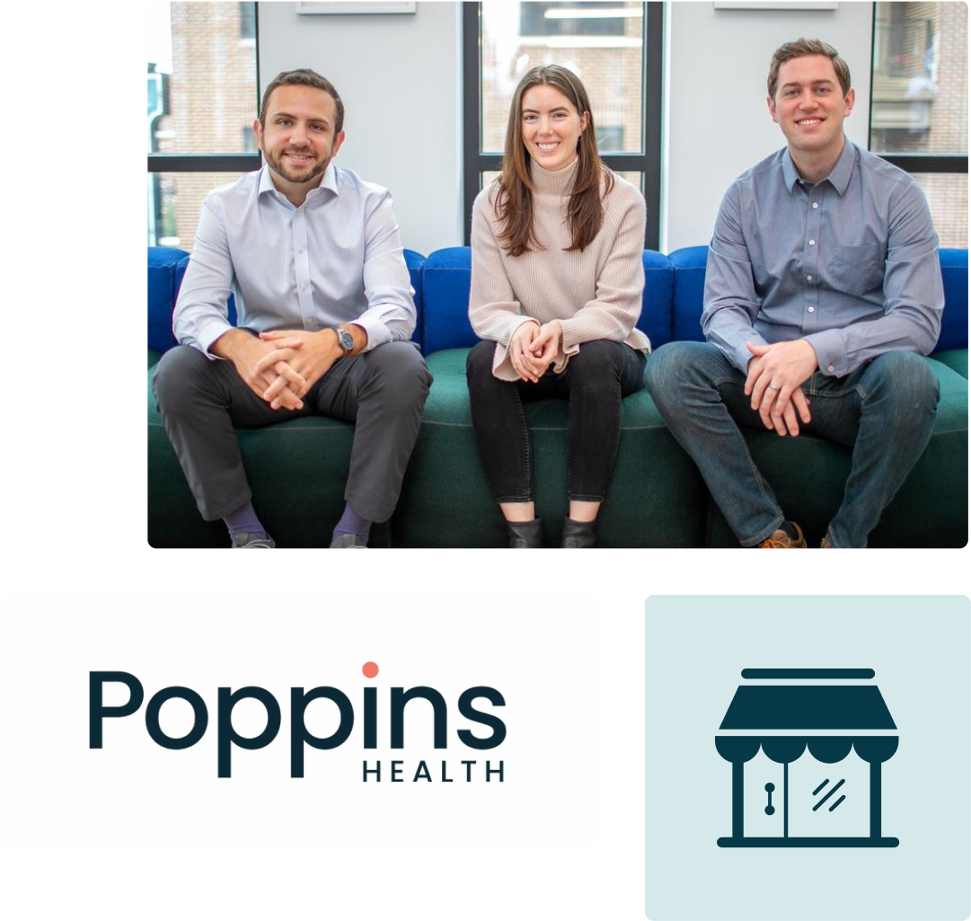
Growing up as the children of entrepreneurs, Brodie, Olivia, and Ross each witnessed the ups and downs of operating a family business.
Finding customers, growing your company, and improving your offerings are all seen as heroic and worthy tasks in the startup world. But less discussed is the invisible weight burdening every small business owner: offering health benefits for their employees.
“No person should go bankrupt paying for health expenses, just as an employer shouldn’t go out of business for providing them.”
Ross, Olivia, and Brodie founded Poppins to take the guesswork out of selecting insurance plans for small business owners.
By optimizing coverage and costs for both the employer and its employees, they can achieve better care and savings for the healthcare system as a whole, as long as the product is designed and used correctly.
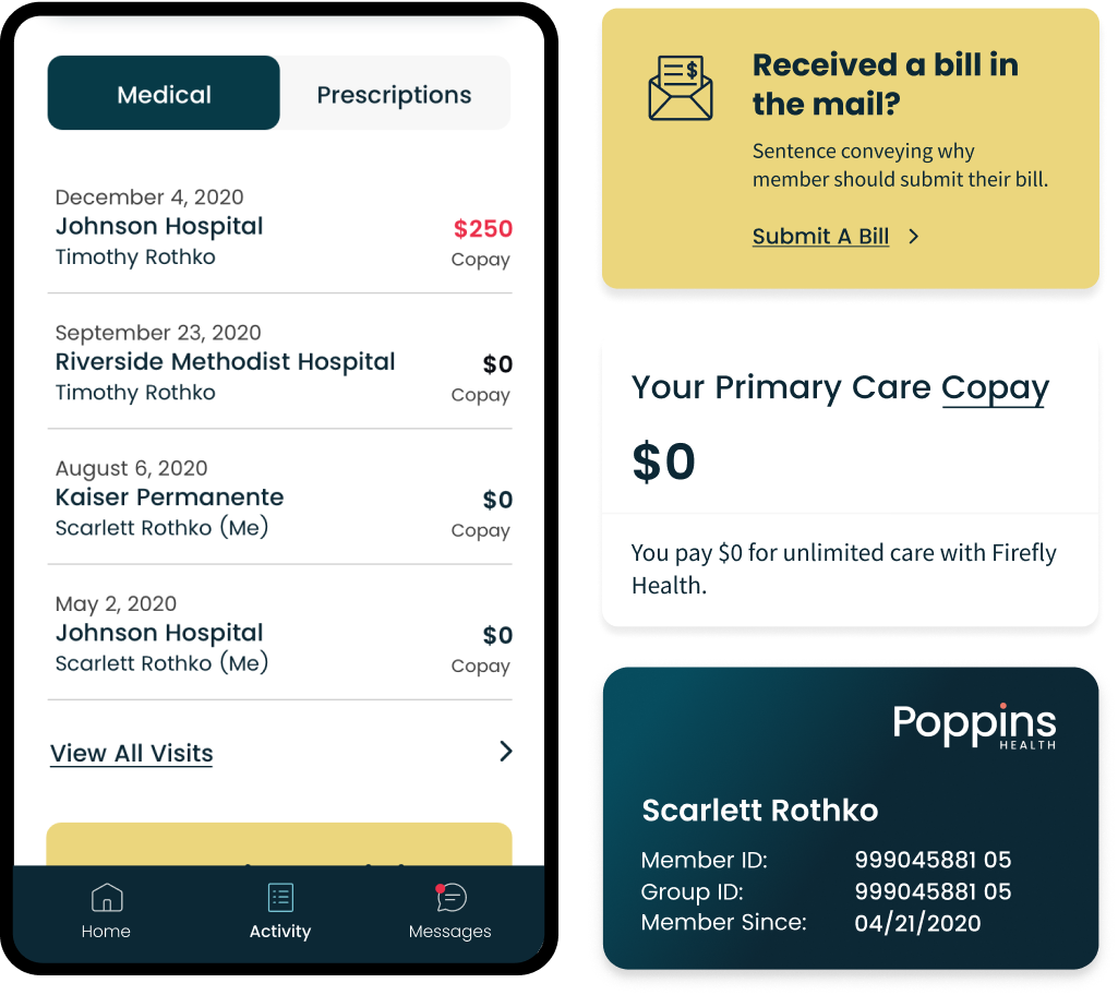
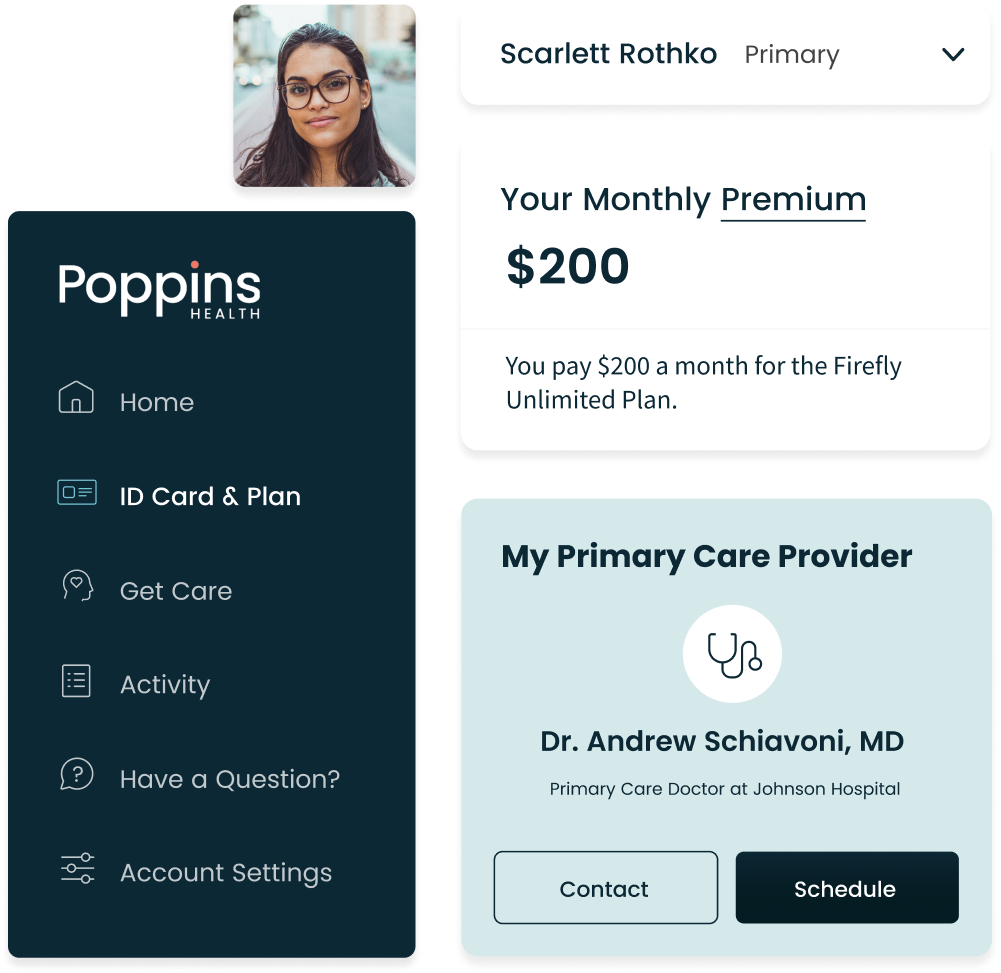
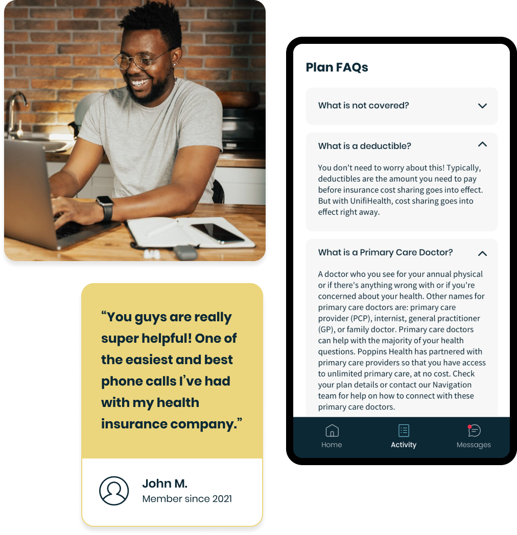
Poppins Health asked our team to redesign their member portal and simplify the effort needed to understand plan coverage. Care and cost transparency were priorities of the engagement.
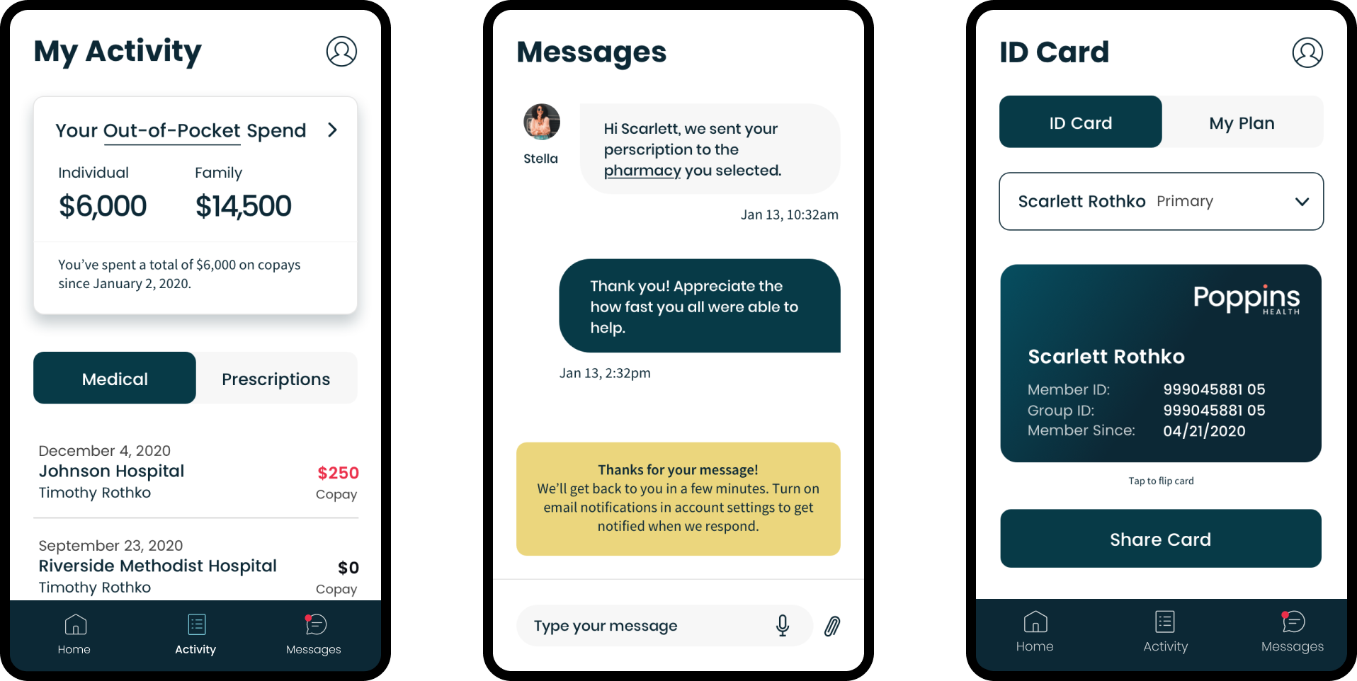
After inheriting a previous agency’s wireframes that were missing key user interactions, we enhanced the visual designs, incorporated a more on-brand look and feel, and introduced a new health-specific information architecture.
Sometimes the best designs we can create are those that are clean, functional, and accessible.
We consolidated frontend components, eliminated unnecessary page views, and reduced workflow complexity to elevate care and cost transparency information for the user.
After redesigning their member portal and elevating their brand, the Poppins Health team raised $7M in seed funding.
They're continuing to expand and helping more small business owners focus on their top priority—taking care of their employees.
“We’re on a mission to help every individual access the right healthcare, at the right place, and at the right price. You know, easy stuff.”